
Finding the ideal screen brightness directly impacts visual comfort, readability, and, ultimately, eye health. The goal is not to maximize screen brightness, but to adjust it according to the room, ambient lighting, and usage conditions.
What is the optimal screen brightness in nits
Screen brightness is measured in nits, or cd/m² — these two units express the same luminance value. For a computer screen used indoors, the right brightness first depends on ambient light, then on perceived contrast, eye sensitivity, and the type of content displayed. As lighting changes, adjusting brightness helps maintain good visibility without creating eye strain.
Health and workplace organizations converge on a range of 250 to 350 cd/m² for typical indoor use. Recommendations on screen brightness provide a solid basis for evaluating whether your settings align with your environment. The Inserm guide also shows how screen brightness and contrast work together on prolonged-use comfort.
In professional display, the logic remains the same, but the constraints differ. For deeper detail, the guide on LED screen brightness by use case covers useful thresholds, while the analysis on transparent LED screen brightness clarifies the effects of structure on visual output.
Nits and cd/m²: Understanding Measurement Units
One nit equals one candela per square meter — this luminance describes the amount of light emitted by the screen surface toward the eye, allowing comparison across different screens under identical conditions.
In practice, three reference points are often enough. Below 300 nits, the setting suits a relatively soft environment. Between 300 and 350 nits, we are in a zone very well suited to an office computer screen. A brightness of 400 nits becomes appropriate in a very exposed room or one heavily lit by artificial light.
Visual perception varies with age, eye sensitivity, exposure duration, and working conditions. This is why recommendations speak in ranges rather than a single universal number.
Recommended values by working environment
The starting point is simple: adjust screen brightness to ambient brightness. In a room between 300 and 500 lux, a value around 250 cd/m² generally works well, with a margin up to 350 cd/m² if lighting increases or ambient light varies throughout the day. Conversely, in a dimly lit space, dropping to 120 to 180 cd/m² often improves visual comfort and reduces eye strain.
- Low indoor lighting: 120 to 180 cd/m², to preserve readability without excessive brightness.
- Standard indoor lighting (300 to 500 lux): 250 to 350 cd/m², optimal brightness range for office work and meetings.
- Very bright environment or large windows: up to 400 nits to maintain visibility.
- Professional LED screen in a sheltered display window: 2,500 to 4,000 cd/m² to compensate for indirect natural light.
Once installation is finalized, brightness remains the most unstable factor. In the morning, ambient light may be soft; in the afternoon, it becomes harsher, especially near a glass wall. To find the most accurate brightness, the setting should be adjusted according to times of day, manually or via a sensor. What the eye retains is reading stability more than raw power.
300 Nits vs 400 nits: What is the concrete difference?
The difference between 300 and 400 nits shows most in mixed-light spaces — glass-walled offices, bright meeting rooms, or stations near a side light source. At 300 nits, readability remains good if anti-glare is effective and screen orientation limits reflections. At 400 nits, visibility holds up better when light strikes the panel more directly in real installations.
For standard office use, 300 nits often makes a solid baseline. Contrast stays comfortable, visual effort is contained, and the risk of eye fatigue decreases over time. Conversely, keeping a higher value without need does not necessarily improve readability and can degrade visual comfort, especially toward the end of the day.
Screen brightness: optimal adjustment and troubleshooting
A poorly calibrated setting, too bright or too dim, quickly degrades reading comfort. Concentration drops, eye strain sets in, and the visual loses stability. To restore lasting reading comfort, brightness adjustment alone is not enough — contrast, reflections, and room lighting also alter screen perception.
Adjusting brightness on Windows 10, 11, and iPhone
Brightness settings vary by device, not by a universal logic. Open display settings, then adjust screen brightness into a comfort zone : 65 to 70 % for brightness, around 85 % for contrast. This pairing is more effective than an isolated adjustment, because output depends on the balance between luminous intensity and readability.
- Windows 10 and 11: Start > Settings > System > Display, then move the slider according to room lighting.
- iPhone: Control Center by swiping from the top-right corner, or Settings > Display & Brightness, with auto-brightness option.
- External monitors: use the physical buttons in the OSD menu to access brightness and contrast settings.
- Auto brightness: available on most modern systems, it adapts brightness level based on detected ambient light.
A clean screen helps more than you might think. Removing dust and smudges limits reflections and improves contrast readability, without unnecessarily pushing display power. In real installations, this is often the first simple fix to resolve a brightness issue.
Contrast and environment for comfortable display
When a screen seems aggressive or dull, the cause is not always brightness alone. A contrast set to 85 % with a light background and dark characters improves readability over long reading or typing sessions. This choice reduces eye strain, provided the room conditions remain consistent.
General lighting should aim for a minimum of 500 lux, with a temperature between 3,300 and 5,300 Kelvin. For a desk lamp, it is better to stay under 200 lux, with a shade directed at documents rather than the screen. Once ambient light is homogeneous, brightness level perception becomes more stable and visual comfort improves.
| Environment | Recommended brightness | Suggested contrast |
| Dimly lit office | 120–180 cd/m² | 450:1 minimum |
| Standard lighting office | 250–350 cd/m² | 450:1 office |
| Very bright room / glass walls | 350–400 cd/m² | > 1,000:1 for color images |
| Semi-outdoor display window | 2,500–4,000 cd/m² | Adaptive sensor recommended |
Screen placement matters as much as its settings. Indirect lighting, grid ceilings, and a screen placed perpendicular to the window at more than 2 meters reduce most reflections — once installation is finalized, consistency between position, ambient light, and settings becomes the real lever for comfort.
Solving a persistent brightness issue on screen
- Outdated GPU drivers: on Windows 10 and 11, a GPU update can restore access to software brightness control.
- Unstable auto setting: temporarily disabling adaptive adjustment lets you verify whether the sensor changes manual settings too frequently.
- Dirty or aging panel: over time, evenness of light diminishes — a cleaning and color calibration can restore some of the output.
- Reflections misidentified: repositioning the screen or adding an anti-glare film sometimes corrects a fault wrongly attributed to brightness alone.
After checking these points, return to a simple baseline : set brightness between 65 and 70 % in system settings, then validate the result in stable conditions. This method gives a reliable benchmark to adjust further according to the room, the displayed task, and ambient light.
Blue light and LED brightness adjustment
Blue light emitted by LED screens is not just a question of luminous power. Brightness level matters, of course, but a chromatic temperature too cold on its own can also disrupt circadian rhythm. To preserve visual comfort, two separate levers must be adjusted : screen brightness on one side, light tone on the other.
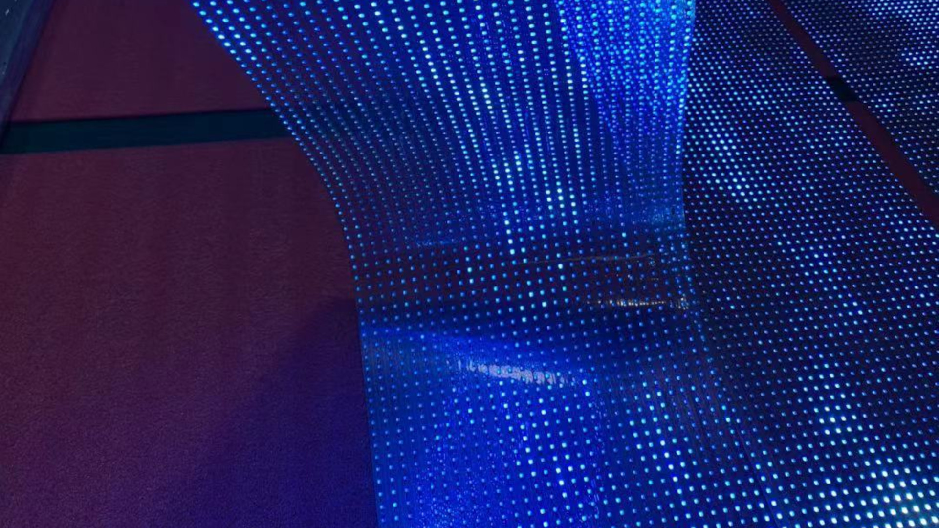
Effects of blue light on eyes and sleep
Screen brightness and blue light form a sensitive pair, especially during prolonged use. When screen brightness stays high and chromatic temperature exceeds 6,500 K, exposure to the blue-violet part of the spectrum increases noticeably. This repeated stimulation can worsen eye fatigue, affect readability by end of day, and for people exposed more than six hours daily, accelerate the onset of eye strain.
As the day advances, the effect changes. Artificial blue light suppresses melatonin secretion and delays falling asleep, even if the displayed visual seems comfortable at first glance. Activating Night Mode on Windows or Night Shift on iPhone lets you switch to warmer tones, between 2,700 and 4,000 K — output depends on the environment and displayed content, but the impact on nighttime visual comfort is generally better controlled.
Efficiently adjusting LED brightness
To adjust LED brightness, three solutions dominate by context : PWM dimming for fixed installations, DMX control for event devices, and software settings for work screens. The difference lies in integration — a good system does not only adjust brightness, it also protects chromatic consistency of content when ambient lighting fluctuates.
On its custom LED screens, FlexLedLight opts for regulation by adaptive light sensors. In real installations, brightness auto-adjusts between 3,000 and 5,500 cd/m² on transparent models, with energy consumption approximately 30 % lower than equivalent opaque panels. This technical choice makes sense as soon as the facade or display window receives variable light inputs throughout the day — once installation is finalized, the screen stays readable without disrupting color perception.
Preventing eye strain through good ergonomics
Good brightness is necessary but not sufficient on its own. To sustainably reduce eye strain, posture, work rhythm, and ambient light in the room must also be considered — a well-set screen loses its value quickly if usage conditions are unfavorable.
As soon as screen brightness is poorly adapted, the body adjusts involuntarily, with more perceived reflections, degrading posture, and, ultimately, headaches or eye discomfort.
The 20–20–20 rule and effective visual breaks
Screen-related eye fatigue often appears by the end of a session. Blurry vision, dry eyes, tension sensations, sometimes headaches — the gaze stays fixed too long, blinking decreases, and ocular muscles remain engaged without relief. The 20–20–20 rule provides a simple framework, easy to maintain in a working day.
- Every 20 minutes: look at an object about 20 feet (6 meters) away for 20 seconds to relax accommodation muscles.
- Short break every hour: allow at least 5 minutes for tasks with high visual demand, such as prolonged reading, intensive typing, or video editing.
- Longer break every 2 hours: about 15 minutes for less demanding activities, limiting both visual load and immobility.
- Voluntary blinking: consciously increasing blink frequency helps reduce ocular dryness without interrupting the activity.
Alternating with screen-free tasks, paper documents, a standing meeting, or a simple walk breaks continuous fixation. Once this alternation is integrated into the day, visual stimulation becomes less continuous and fatigue signs appear later.
Workstation layout and adapted posture
Workstation ergonomics directly influence perceived visual comfort. A poorly set distance, a viewing angle too high, or a screen poorly placed in the room increase reflections and push the user to lean toward the panel, even with good brightness.
- Screen-to-eye distance: between 50 and 70 cm, about arm length, with the top of the screen at eye level or slightly below.
- Screen positioning: place perpendicular to the window, at more than 2 meters if possible, with blinds or curtains to stabilize ambient light.
- Sitting posture: arms and forearms at 90 to 135°, feet flat, back supported. The most adapted posture is one you can adjust regularly without strain.
The difference lies in integration : if screen brightness is too strong or too weak, the user leans forward, stretches the neck, and tenses the shoulders. It is better to adapt brightness first before making finer posture corrections, because a coherent light setting often eliminates some of the bad compensations.
Daily habits to preserve vision
Daily, the most useful action is to adapt brightness according to time of day and the actual exposure of the room. Output depends on ambient light : a correct level in the morning can become excessive at noon or insufficient by late afternoon, especially if conditions change with the sun, blinds, or indoor lighting.
In the evening, it is advisable to reduce color temperature via a night mode or software filter, then lower screen brightness, around 20 %. This gentler transition limits blue light effects on the visual system and helps reduce eye strain at the end of the day.
What the eye retains is the balance between technology, usage, and environment — no single setting is sufficient on its own.
Frequently Asked Questions
What is the optimal brightness for an office computer screen?
For indoor use with ambient lighting of 300 to 500 lux, the optimal brightness of a computer screen generally falls between 250 and 350 cd/m², or 250 to 350 nits. This range offers a good balance between readability, visual comfort, and detail visibility, as long as room conditions remain stable.
Below 120 cd/m², the eye compensates more and eye fatigue appears faster. Conversely, exceeding 400 cd/m² in a dim space creates too large a gap with surrounding lighting — visual fatigue sets in permanently, noticeable from the first hours of use.
As a starting point, a brightness level set around 65 to 70 % in the system remains consistent. Once the installation is finalized, output depends on eye sensitivity, reading distance, and the lighting conditions of the room.
What is the 20–20–20 rule for eyes?
The 20–20–20 rule helps limit visual fatigue from prolonged screen work. Every 20 minutes, looking for 20 seconds at a point about 20 feet (6 meters) away is enough to relax the focus.
This reflex also has a concrete effect on ocular comfort : it promotes natural blinking and reduces dryness often felt in front of a fixed display. The difference lies in integrating this break into the day, especially when lighting, concentration, and exposure duration are sustained.
Paired with 5 minutes of break per hour, this method retains real preventive value. It improves long-term perceived readability, because a less strained eye handles visual and brightness variations better.
What does 300 nits represent concretely?
300 nits, or 300 cd/m², sits at the heart of the recommended range for indoor use — bright enough to display fine details, without creating a harsh contrast with the environment.
In practice, this means a screen remains readable without appearing aggressive when ambient light is controlled. What the eye retains is the gap between the displayed surface and room lighting : if this gap becomes too pronounced, eye fatigue and visual discomfort progress.
If the environment is dark, a lower brightness level may suffice. Conversely, if ambient light is stronger, it may be necessary to raise it slightly to keep the visual gap in a tolerable range.