
Color calibration directly shapes the visual quality of any photo or video production. It establishes a consistent rendering pipeline from capture through post-production, display on screens, and output on LED installations.
What Is Color Calibration in Photo and Video?
Color calibration involves measuring, correcting, and harmonizing every color in an image to guarantee faithful reproduction across all media. In both photography and video, this step occurs during post-production to align brightness, hue, contrast, and tonal levels with the original creative intent. The final result depends on the entire chain: capture, monitoring screen, lighting environment, and color adjustments.
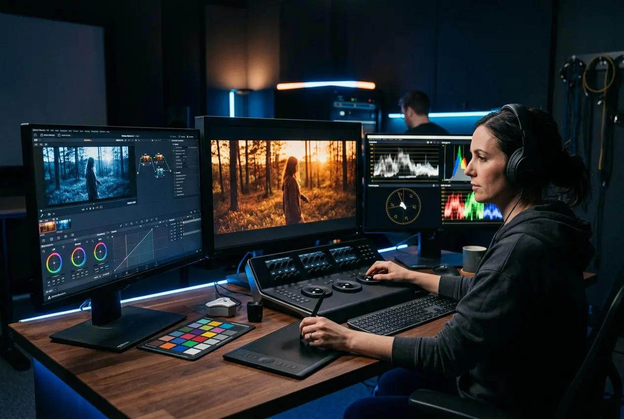
Definition and Core Principle
In practice, calibration adjusts brightness, whites, shadows, highlights, and color balance to build a readable image. Raw capture often appears flat, with low contrast and uncertain color temperature. After the work is complete, the footage or photo gains coherence, depth, and visual style.
- Brightness: Adjust light intensity, contrast, highlights, and shadow areas to prioritize what the eye should see in the scene.
- Color: Set hue, white balance, tint, and saturation to stabilize the overall palette.
- Structure: Work with curves, levels, and selective color when needed to refine specific zones without unbalancing the image.
This process draws on color theory, dominant-tone reading, and mastery of appropriate tools. Color grading also ensures consistency between multiple shots, so a sequence retains the same visual identity from first to final frame.
Color Correction vs. Creative Grading
Color correction lays the groundwork. It aims for a believable baseline: white balance, color temperature, contrast, levels, and exposure are adjusted to restore clean whites, stable skin tones, and readable lighting. Once this foundation is solid, creative choices become far more reliable.
Creative grading then shapes the aesthetic. It defines a grading style, reinforces a mood, accentuates a hue, or isolates a zone through selective color to support the narrative. Unlike a simple technical reset, it targets a deliberate final look — whether cinematic, commercial, or documentary. It is especially effective when lighting is part of the scene itself.
Best Screen Calibration Software
In post-production, reliable calibration software secures white balance before any aesthetic decision, especially when multiple monitors or multiple contributors are involved in the project.
- DaVinci Resolve: The industry-standard solution for video and film, with advanced curves, precise contrast management, and a complete color-correction toolkit.
- Adobe Lightroom: Ideal for photography, with detailed control over every color through hue, saturation, and luminance.
- Adobe Photoshop: Useful for localized retouching via adjustment layers, curves, levels, and selective color.
- DMX control software: Helpful for real-time color adjustment on LED devices, especially when the installation itself directly influences the perceived result.
What the eye retains is the coherence between captured light, monitoring screen, and the displayed image. This rigor prevents color shifts, tinted whites, and overly harsh contrasts once the content is rendered on the LED installation.
How Color Calibration Works in Practice
Color calibration follows a progressive logic: exposure stabilizes first, white balance is corrected next, then hue and saturation adjustments refine the look. This sequence minimizes shot-to-shot discrepancies and helps maintain visual continuity across a photo series or video sequence.
The Three Axes of Color Adjustment
Brightness sets the tonal foundation, color builds the atmosphere, and texture preserves the natural quality of materials. Adjusting saturation fits into this balance: warm, dense hues create an energetic read, while muted colors calm the image and make it more restrained.
For nuanced color modifications, color wheels remain the central tool. A global wheel affects the entire image, while others split shadows, midtones, and highlights — adjusting each range independently keeps contrast stable from shot to shot.
How to Adjust Color Saturation Effectively
Complementary pairings boost contrast, while analogous harmonies create a smoother continuity. This principle helps steer a hue without unbalancing the overall image. Once the visual mood is set, that reference point prevents random oversaturation and gives a coherent direction to the treatment.
In practice, color balance is built on a clean technical base first. White balance must be reliable, brightness held steady, then saturation increased in small increments while monitoring the Vectorscope to stay within the target gamut. Conversely, saturating too early often pushes dominant tones and loses naturalism, especially on skin tones in both photo and video.
Essential Colorimetric Analysis Tools
Preserving natural skin tones requires objective reference points independent of the monitoring screen. Waveform controls brightness on a 0–100 scale, the Histogram shows value distribution, and the Vectorscope tracks hue and saturation level: the output depends on what these tools confirm, not just the immediate visual impression.
RGB color codes complement this reading by providing numerical references for calibration. Once the installation is finalized, these values help maintain believable whites, monitor channel discrepancies, and correct a dominant shift without degrading the overall image balance.
The Narrative and Emotional Role of Video Color Grading
Video color grading is not merely about fixing a color drift, an exposure error, or poorly balanced whites. It sculpts the atmosphere of a scene, supports the visual narrative, and steers the emotional read without changing the frame, subject, or captured lighting. In practice, color grading acts as a layer of added meaning: what the viewer retains is often the mood before any mise-en-scène detail.

How Color Guides Viewer Emotions
In a video, photo, or film, color influences perception immediately. A warm tone can create intimacy, while a cooler rendering produces distance, doubt, or latent tension. The outcome depends on the balance between saturation, contrast, highlights, and shadow density.
This emotional read often registers before the dialogue — and sometimes before the edit itself. A consistent grading style gives each scene a deliberate emotional direction, useful for connecting a location, a character, or a period to a precise sensation.
- Warm tones (gold, orange): Suited for intimate narratives, memories, reunion photography, or family scenes where the lighting should feel welcoming.
- Cool tones (blues, cyan): Used to install calm, melancholy, or tension — especially in thrillers, dramas, and certain nocturnal urban universes.
- Desaturated colors: Effective for underscoring isolation, fatigue, or the gravity of a situation, provided enough contrast remains to keep the image readable.
A recurring color or a stable treatment of lighting can be enough to tie several sequences together. It works best when lighting is part of the set: the effect is stronger when capture, photography, and post-production all move in the same direction.
Cinematic Grading Styles and Their Visual Effects
The difference lies in integration: a convincing grading style extends the original intent rather than artificially overwriting the image.
Among the most commonly used approaches, split toning distributes different dominant tones between shadows and highlights, which deepens volume perception. Bleach Bypass pushes the image toward a drier, grainier, desaturated look with strong contrast. Black and white removes color entirely to focus attention on textures, whites, faces, and the structure of light — much like a well-calibrated monitoring screen.
| Grading Style | Visual Effect | Typical Use |
| Teal & Orange | Blue-green shadows, orange skin tones, strong contrast | Blockbuster cinema, TV series |
| Bleach Bypass | Dry, grainy, desaturated look | Dramatic films, war scenes |
| Black & White | Color removal, contrast emphasis | Art-house films, documentaries |
| Split Toning | Distinct colors in shadows and highlights | Fashion photography, music videos |
| Cinematic LUT | Consistent style applied in one click across all shots | Fast productions, standardized grading |
LUTs remain a practical tool in a deliberate grading workflow — they save time, especially when the same style must be applied to many shots. They provide a coherent starting point for editing and grading, but they do not replace fine adjustments to hue, contrast, or highlights. When varied light sources, different cameras, or a more demanding fiction film come into play, results depend largely on adapting the LUT to each scene.
Solving LED Screen Color Issues
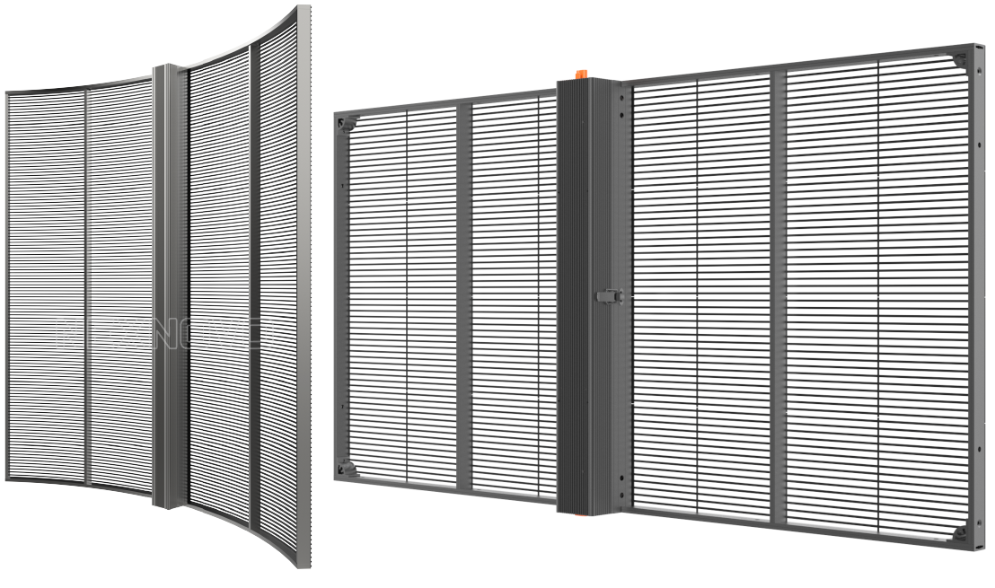
Color anomalies on an LED screen do not always signal a severe failure. A poor color setting, a degraded connection, an improperly applied LUT, or the progressive wear of individual diodes may be enough to shift a hue, alter brightness, or unbalance the overall light. Identifying the exact root cause allows you to fix the color issue with the right method, without replacing components that are still functional.
Identifying Chromatic Anomaly Causes
The first check covers the signal chain: cables, connectors, and connection quality. As soon as the transmission degrades, color becomes unstable, certain hues shift, and variations appear on-screen in the actual installation. Shielded cables and a thorough inspection of connections are often sufficient to correct the defect.
If the anomaly remains localized, inspect the LED modules. A failing diode disrupts the light emitted by the affected pixel and creates a visible break in the image, sometimes with a chromatic shift limited to a specific zone. In some cases, a reactivation tool can repair isolated dead pixels; otherwise, replacing the affected module restores uniform color.
The diagnosis continues with the receiving card and its control LEDs. These quickly reveal transmission faults or misconfigured software settings, especially when a color calibration was lost after an intervention or software update. In this context, redoing the calibration, verifying the applied LUT, and correcting active profiles often restores a consistent hue without hardware intervention.
Calibration and Maintenance for Color Stability
Chromatic drift of LED diodes occurs naturally over operating hours: a calibration performed every six months compensates for this evolution and maintains faithful reproduction of every color. The LED color calibration guide describes the key checkpoints for preserving rendering quality and limiting brightness deviations.
This stability also depends on thermal conditions. When heat builds up, components fatigue faster and chromatic drift intensifies, eventually undermining the calibration performed. Maintaining brightness around 80% and planning daily rest periods help keep light more consistent: the final result depends directly on the actual operating temperature.
- Semi-annual calibration: Compensates for the natural chromatic drift of diodes and maintains color fidelity over time.
- Monthly cleaning: Dry microfiber cloth, no alcohol or solvent, to preserve light quality without damaging optical components.
- Adequate ventilation: At least 10 cm clearance on sides and regular fan cleaning to stabilize brightness, hue, and calibration.
- Quarterly connection checks: Reduces signal loss and color deviations across the entire LED surface.
A properly maintained LED screen can exceed 100,000 operating hours with stable chromatic behavior.
Color Calibration for Large LED Screens and Professional Photography
Color calibration of a large LED screen is not just a post-production software setting. On this type of installation, color accuracy also depends on RGB driving, the DMX protocol, and electrical stability. As soon as these parameters vary, the perceived hue changes — sometimes noticeably in both photo and video.
How to Calibrate LED Screen Color via DMX
Color calibration of a large LED screen relies on mixing Red, Green, and Blue channels. In an RGBW configuration, a White channel fine-tunes white rendering and improves color balance on bright scenes or architectural lighting setups. The 4‑color architectural spot, at 25 W, 24 V and IP65, enables fine adjustment via DMX with an extended palette of hues.
DMX plays a central role here: it adjusts the intensity of each channel separately, allows smooth transitions, and maintains a coherent color balance from one scene to the next. In a real installation, the difference shows in the integration between the controller, LED sources, and power supply. Stable voltage remains essential to preserve brightness, prevent chromatic drift, and keep rendering usable for photography and video.
This logic carries over to higher-power fixtures. The 100 W DMX LED projector allows precise control over color, brightness, and temporal variations. This level of control matters most when the installation must stay consistent across a large surface or across multiple synchronized modules.
Chromatic Consistency in Video and Photography
Calibrating screen color in a professional photography context demands a strict methodology. The displayed hue must match what the sensor records, with no offset between the LED source, the camera’s white balance, and the lighting environment. Conversely, a poorly prepared white balance produces dominant shifts that are hard to correct, even with excellent post-production grading.
In video, the scale of the challenge changes. Visual continuity must be maintained between shots, sequences, and display surfaces — which often requires a LUT matched to the LED wall’s output. The outcome depends on both initial calibration and how the LUT is applied to the outputs: the goal remains the same, achieving homogeneous grading with no visible breaks or brightness variation between modules.
This consistency also covers studio photography, event capture, and content destined for post-production. Once the installation is finalized, cross-checking between display output, camera sensor, and a reference monitor allows color calibration of a screen with greater confidence. This upfront work simplifies later corrections, reduces heavy reshoots, and protects color balance across the entire production pipeline.
Best Practices for Sustainable LED Calibration
Chromatic stability does not rest on a single adjustment. It depends on technical choices made at installation: IP65 protection outdoors, proper ventilation, preventive maintenance, and quality cabling. It is especially worthwhile when lighting is part of the scene, because any color drift eventually shows on a facade, a stage backdrop, or a camera shot.
- Brightness capped at 80%: This setting reduces thermal stress on diodes and helps maintain stable color over time.
- Semi-annual recalibration: Necessary to compensate for natural LED evolution and keep color balance aligned with production expectations.
- Quality shielded cabling: Secures signal transmission and limits variations that affect color or DMX channel response.
What the eye retains is consistency between two operating dates, two video captures, or two photo sessions. FlexLedLight selects IP65 components and stable drivers because color fidelity depends as much on the hardware chosen upfront as on the maintenance protocols applied on-site. Once these conditions are met, the installation delivers more predictable performance and remains easier to recalibrate.
Frequently Asked Questions
What is color calibration in photo and video?
In both photography and video, color calibration is a post-production process that adjusts color, hue, contrast, and brightness to achieve a precise visual style. In photography, it corrects dominant shifts from capture, white balance, or color temperature, restoring a chromatically neutral image with a more accurate read.
In video, it harmonizes shots across a sequence and minimizes noticeable discrepancies from scene to scene: what the viewer retains is the continuity of color and contrast, not the individual corrections. The final quality depends on the raw footage, but also on the precision applied to each adjustment.
What is the difference between color correction and creative grading?
Color correction comes first. It aims for a reliable baseline on exposure, white balance, and color temperature to neutralize chromatic drift or dominant shifts that distort the image. This phase establishes a solid foundation — especially when lighting is part of the scene and must remain believable.
Creative grading then builds the intent. It alters the overall hue, reinforces or reduces contrast, and gives direction to the visual style: warm tones, teal-and-orange shadows, or a drier Bleach Bypass treatment. The difference lies in integration: color correction restores an accurate image, while creative grading transforms that base into a final rendered look consistent with the narrative.
How to maintain stable calibration on a large LED screen?
On a large LED screen, chromatic stability does not rely on a single setting. It depends on semi-annual calibration to compensate for natural diode drift, stable power supply to prevent color fluctuations, and active thermal management: adequate ventilation and brightness capped at 80% to protect components.
As the installation ages, preventive maintenance becomes critical. Quarterly connection checks and the use of shielded cables reduce signal degradation that can affect hue, contrast, and the calibrated color displayed on the screen.